
ONS Ball
Regarding the reanimated ONS spreadsheet

Author note: As usual, I was over-optimistic in last week’s out-of-office notice, hoping I would be able to cram an explosion of work into a few days to cover up the coming second weekend away from my workstation. Normal output should resume next week!

“Deeply flawed”
And so welcome back to Unglossed, the anti-Covid-vaccine and generally vaccine-skeptical journal that increasingly devotes posts to demonstrating that excess death statistics do not reflect post-vaccine deaths. It is necessary to point this fact out, not because it supports any particular conclusion, but because it is true. There is no use pretending that it is not true; illusions will only get one so far in sustaining any belief.
Today’s reality-check: Back to the ONS sheets.
If you’ve already encountered commentary regarding the revived and revamped ONS data, you’ve probably heard that it is still “deeply flawed.”

What the reader should understand immediately is that this claim is tantamount to calling a love interest “deeply flawed” after it turns out the feeling is not mutual. All that is really meant by “deeply flawed” is that the ONS data still isn’t returning the desired results. The slut!
What the ONS data is, actually, is potentially accurate, but (probably) biased.1 (I include “potentially” because the radical update may easily have introduced some new errors which will have to be ironed out. This includes two big goofs which have already been corrected; offset month labeling and swapped sexes in Table 4.)
But since it doesn’t reflect the desired outcome, it is called “inaccurate,” “fake,” etc. Rather than (probably) biased (like the love interest that doesn’t return the feeling). My strong impression is that all the arguments for why the ONS data is inaccurate are motivated-reasoning back-fills supplied after the claim is already made.
And so to “prove” that the ONS data is inaccurate, the current popular trend is simply to swap the ONS denominators for imaginary denominators that support the desired outcome. What an idea — why didn’t anyone think of this before?! Imagine how easy it will be to prove things now! Hooray! Covid vax slam dunks forever!

Validating the denominator
Now we may address the claim, made by the usually insightful and incisive Igor, that the unvaccinated denominator has been deflated (to jack up the unvaxxed mortality rate, resulting in an unfair comparison with the vaxxed mortality rate).

So, whose number is correct? Were only 6.19% of 50-59-year-olds unvaccinated at the time (per the ONS), or 13% (per the UKHSA)? The answer is that the second number (13%) from the UKHSA is correct and is based on databases of named UK residents eligible for vaccination.
So, the ONS understates the number of unvaccinated people by about 2x (depending on age category).
This claim, unfortunately, is not correct.
Firstly, the ONS data is not purporting to represent the general population. It is better thought of as an “elite club;” it records deaths and time spend being alive for a portion of Brits. Specifically, those who are in the Public Health Data Asset.
If someone dies who wasn’t already “known living” by being in the census and not previously recorded as dead, their death is not counted on the spreadsheet. Therefore, it does not matter that their time alive is also missing on the same.
It is not relevant whether the ONS subset’s unvaccinated proportions are the same as those recorded by other UK authorities for the country as a whole; no more than whether they are the same as unvaccinated Lithuanian street-sweepers. The spreadsheet is not measuring that.
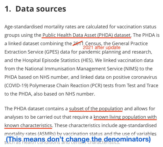
Igor’s claim has a problem beyond being discordant with the stated design of the ONS data. Namely, the currently-vaccinated start off in the spreadsheet as unvaccinated.
This is more easily visible in the pre-update versions; but still can be observed for the 18-39 age group in May, 2021 (the earliest month shown in the new version, as earlier months predate the census).
From Table 4:

It is not possible to systemically undercount “the unvaccinated” in the PHDA because that is where the entire population “starts off.”
Rather, the ONS would have to have under-clocked the overall population beforehand, without this manipulation somehow having become apparent as they updated the spreadsheet throughout the vaccine rollout. Again, this is better demonstrated in the pre-update version of the tables, which extends to January, 2021:
Here, in the pre-update version, it can clearly be seen that:
The unvaccinated 40-49 year olds have not gone negative in May, despite little change to the combined unvaccinated + any population (247k person-years). Thus, if the unvaccinated are being “half-counted” in May or afterward, this deception somehow had to be projected in advance of anyone in this age group being vaccinated (i.e., by lopping off about 600,000 future unvaccinated women from the PHDA before anyone got vaccinated).
The vaccinated 18-39 year-olds "die more." This is due to grouping 30 year-olds and younger adults together, though they have different baseline death rates and different vaccinated proportions over time. This (along with similar results in other multi-age groups) shows the unvaccinated denominators are not too low (a more likely problem, in fact, is that they are too high2).
In Perspective: Rates, Schmates
Igor claims that the distorted comparison with the unvaccinated explains how, despite appearing to die less often, the vaccinated are driving the cloud of excess deaths that has hung over the UK since mid-2022 (coincidentally when the previous version of the ONS tables went offline).
This is both true and false. False, because the unvaccinated denominators are not “fake;” they are correct for the PHDA population actually being tracked in the table.
True, because in raw counts, obviously, most deaths are among the Covid-vaccinated. It is almost materially impossible for the unvaccinated to still be driving excess deaths. I could go around murdering everyone I meet with the initials “DZ,” for example — and although the DZ’s of the world will start dying at a higher rate, it won’t move excess deaths statistics.
This explains the paradox of the current ONS update. The unvaccinated in the ONS dataset are still “dying more” in most age groups and most months, despite depletion of the most vulnerable, due (probably) to general healthy user bias among the Covid-vaccinated (see footnote 1, below).
But this probably isn’t driving excess deaths (in the overall statistics, regardless of whether the whole population has a bit more unvaccinated than the PHDA). The Covid-vaccinated make up most people, especially most elderly, and it can be clearly seen in the ONS table that they make up most deaths. What matters is the absolute count, not the rate.
Most deaths are among the elderly; most are Covid-vaccinated:
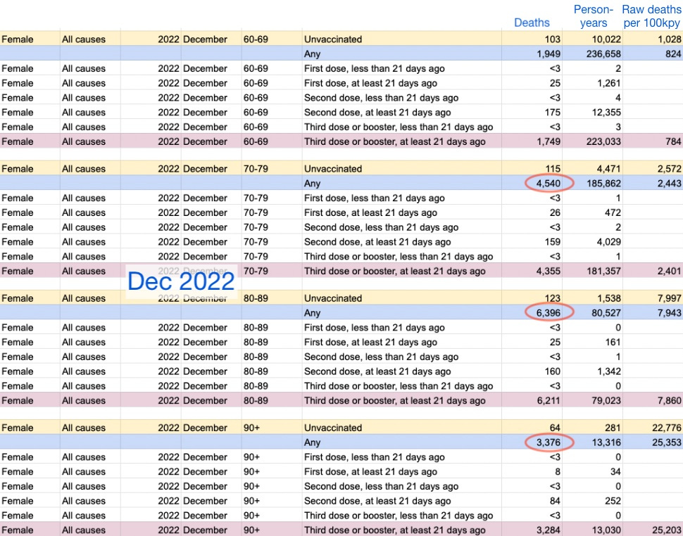
If we want to further explore whether the recent Covid-vaccinated death rates are “excessive,” a more apt comparison is with rates from 2021. To be consistent, we must use the new update’s values. Here is the same data as above compared to May and December, 2021 (the last real trough between SARS-CoV-2 infections and the first Omicron wave, respectively).

This also shows that deaths (absolute and rate) have become higher in the 3rd-dose group, whereas it was fewer-dosed elderly who drove deaths the December before. This supports a role of “catch-up” infections with SARS-CoV-2 in the excess mortality trend.
The same comparison could be repeated for previous months (which I have yet to format); and may support the general picture that the Covid vaccinated elderly are steadily dying at above-2021 rates throughout late 2022. Or, it may reveal additional problems in the younger groups (though this snapshot of male 60-69 year-olds does not suggest any).
Also, note once again that this demonstrates that the unvaccinated denominator is not “fake” or broken; because deaths and deaths per person-year both decrease in December, 2022 despite little change in person-years (i.e. the value for how many people in the ONS dataset are unvaccinated in each age group); whereas no great changes in rate are caused by the reduction in person-years between May and December, 2021 (rather, it is deaths that increase).
Conclusions:
The revamped ONS data does not seem “deeply flawed” (though probably deeply biased; again see footnote 1 for discussion). There is no apparent problem with the unvaccinated denominator (again, it does not matter whether it matches the whole population).
Excess mortality seems to be a reflection of the Covid-vaccinated elderly dying in rates more in line with last winter. This may be due to infections with SARS-CoV-2 or with other seasonal viruses (see, again, Witzbold’s analysis regarding the latter possibility).
If you derived value from this post, please drop a few coins in your fact-barista’s tip jar.


What is the bias?
The ONS spreadsheet is biased by a tendency for most deaths to be predictable. This is especially true for the elderly; and since most deaths are among the elderly, it is true generally. In the UK, counter-intuitively or not, those who are observably declining toward death do not get injected with Covid vaccines.
This bias is strongly observable in the lower-than-baseline death rates that immediately follow injection; as well as the higher-than-baseline death rates that pervade in “straggler” groups, like people who for whatever mysterious reason don’t get their second injection on time. All of these artifacts can be found in different age groups and “time-since-injection” buckets across different months, depending on how “fresh” or not the vaccine roll-out was at the time.
For this reason, the same artifacts are not well explained by any claims of "lags" or “misclassification.”
In other words, it is trivially easy to claim a lag or similar problem with the spreadsheet. But then you could form a prediction with the same claim — e.g., in the pre-update version which included the early months of 2021, a lag would predict “70 year old 1st dose ≥ 21 days ago should have a higher-than-baseline deaths rate, because post-2nd-dose deaths are being incorrectly slotted into this bucket.” This exact prediction would, however, be false.
(Whereas, 1st dose ≥21 days death rates begin to climb after most individuals in a given age group have moved on to the 2nd dose, not while they are doing so. Again, this is better explained by a bias against injecting those who are observably declining toward death.)
Likewise, you can ask those who make such claims “what about this prediction your claim implies,” and your comment will simply be ignored.
Thus, the bias that explains these artifacts is the “not-on-deathbed bias.”
Besides this, the ONS data is probably skewed by an extreme healthy user bias in the UK, which is exacerbated by social factors such as high conformity (do-your-part-ism) and secularity (lack of religious objection to experimental gene injections).
The “unvaccinated” in this dataset are (probably) not health conscious; many may prefer to avoid healthcare in general and have only found their way into the PHDA because avoiding healthcare is no longer possible — i.e., they are experiencing complications from poor health choices or general aging.
This may seem to generate paradoxes — i.e., that the Covid-vaccinated are dying “less than normal.” And those paradoxes may feed an impulse to throw phones across the room and call the ONS spreadsheet a slut again. But it is important to remember that the work of “dying” at any given moment is always undertaken by outliers. The “normal death rate” by definition never applies to those in a population who do not die.
However, the ONS dataset is valuable precisely for minimizing the likelihood of over-counting the unvaccinated.
I specifically looked at 50-59s in March because we have reputable data (UKHSA) for the same exact population for the same exact moment in time.
That reputable data disagrees with ONS unvaxed percentage by over 2x.
I find it to be almost unimaginable that the ONS could somehow construct a "population subset" that would truly contain, name by name, only half of the overall UK's unvaccinated percentage for that age group.
So, in my opinion, ONS data is fake and undercounts the unvaxed. What is the exact mechanism for this undercounting remains to be discovered. But it presents percentages that are totally nonsensical.
The NIMS data used by the UKHSA (giving correct unvaxed head counts) is high quality data based on NAMES of all people eligible for first dose.
The result of ONS understatement of the number of unvaxed is their unbelievable 60% greater all-cause mortality among the unvaccinated compared to boosted (50-59, Dec 2022). This makes no sense and does not show up in low-vax countries like Bulgaria.
Whether we can massage it to adjust for the correct number of unvaccinated people, is a valid question. Such an adjustment leads to much more realistic mortality numbers. However, I accept that not all people would vouch for this particular way of adjusting.
As the late Donald Rumsfeld once observed, "You go to war with the army you have, not the army you might want or wish to have at a later time."
By the same token, we always have to do analyses with the data we have, not the data we wish we had, with the constant caveat that the data we have is likely either incorrect, incomplete, or both.